cinematographic atlas
Theatres screens' accessibility
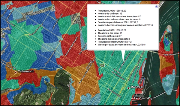
This series of maps is designed to compare the supply of theaters and screens as a function of population density (in 2001). These maps are available in KML (viewable with Google Earth). The polygons representing service areas are made based on the number of available screens within a five minutes car drive, under ideal conditions (this analysis was performed using the service area analysis, in ArcGIS). The results show neighborhoods where the number of theater available within 5 minutes is less than (blue) - or higher than (red) - would suggest the population density. These results were discussed in a paper published in the Cahiers de géographie du Québec (Caquard, Naud and Périchon 2009).
KML files are created with ArcGIS and Shp2kml. They can be opened with Google Earth.
In the spirit of the Creative commons, data collected and created in the context of this project are available to visitors and researchers, provided that three conditions are met:
- Attribution: You must attribute the work in the manner specified by the author or licensor (but not in any way that suggests that they endorse you or your use of the work).
- Noncommercial : You may not use this work for commercial purposes.
- Share Alike: If you alter, transform, or build upon this work, you may distribute the resulting work only under the same or similar license to this one.
